We have overcast, grey skies and snow again. The few, bright yellow daffodils that were blooming are completely bent over with their heads in the snow and the purple pansies I just planted are totally buried. I’m tired of the bleakness; I need color!
If you stop and think about it, the role that color plays in our lives is amazing. Color affect us in both subtle and obvious ways; it helps determine our mood and can invite us in or turn us away. It has a say in what we choose to eat, what we wear, what we buy and even what we plant in our gardens. Our reactions to color are foremost immediate and instinctive, but also culturally defined and based on our personal experiences. Our color choices are a window into who we are.

Culture helps define color choices. A bride in the United States wears white, while a Chinese bride wears red.
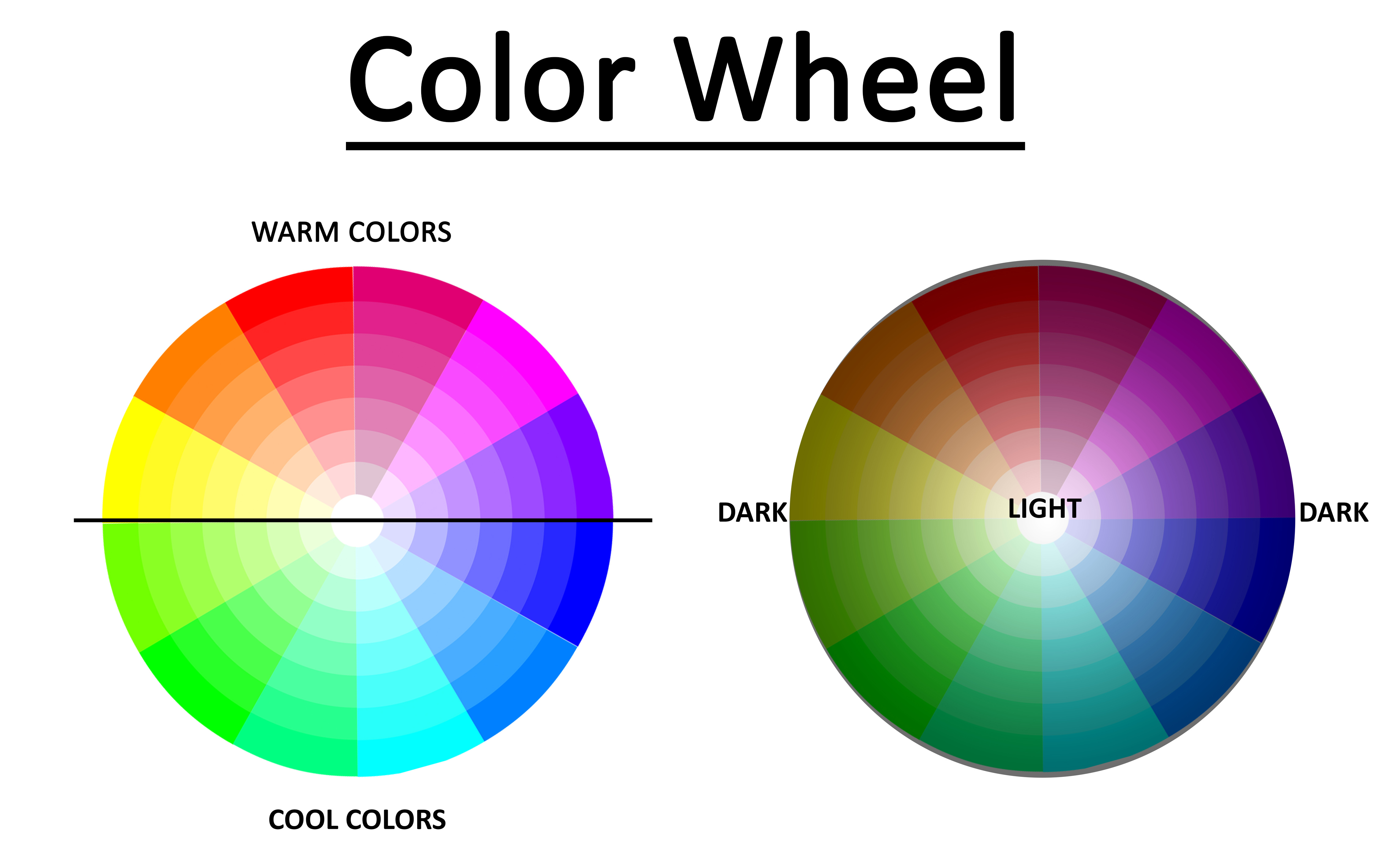
Colors can be divided into two groups — warm colors and cool colors. Warm colors are made from reds, oranges and yellows; they are vibrant and tend to jump out at you. Cool colors, the blues, greens, greys and light purples, are calming and tend to recede into the distance. Warm colors are stimulating to the senses and liven up a space while cool colors relax you.
In the same vein, dark and light colors send subliminal messages too. Darker hues communicate strength, power and authority. They suggest elegance and richness. A lighter shade, even of the same color, creates a softer, gentler effect that will seem further away. Using light and dark shades together can be an effective way to create a sense of space and depth.

Although we can look at the effect that categories of color have on us, understanding the impact of individual colors is also important to the design of our gardens. Sandy DeFoe, artistic director at Embassy Landscape Group, has studied the impact of color for years. She contends that color is “instant nonverbal communication” and that knowing how to use color effectively works to our advantage “by keeping things interesting and relevant.”
Just as the color scheme of your living room tells your story and sets its tone, the color scheme of your garden helps to establish its mood and purpose.Will it be your place to quietly sit and recharge? Perhaps you see it as the area to gather happily with friends and family. Whatever your dream, understanding some of the basics of color psychology and the principles of designing with color can help you bring to life the visions you hold in your mind. Explore the following color messages today and join us next time as we explore combining color messages with design principles to create living works of art in your own yard.
COLOR MESSAGES

RED: Exciting, Courageous, Dramatic
Red is a powerful color. It is vibrant and attention grabbing, a color that immediately draws the eye toward it. .Darkening red by adding black creates rich shades of maroon that communicate opulence and refinement.

PINK: Lively, Sweet, Safe
Although true pink is a softly feminine color that has feelings of tenderness and nurturing tied to it, pink can also be seen as overly optimistic and unrealistic (as in seeing the world rose-colored glasses) Shades of hot pink are high energy, youthful and even a bit wild. Darkening shades toward magenta are thought of as dramatic.

ORANGE: Vital, Friendly, Outgoing
Orange is another highly visible color. It is considered a “friendly and outgoing” color, and sends a message of encouragement. Children seem to like the color orange, The color orange is typically more popular in the fall as it calls to mind the vibrant colors of fall foliage. The more muted shades, like apricot and peach speak of sophistication and approach-ability.

YELLOW: Warm, Energetic, Optimistic
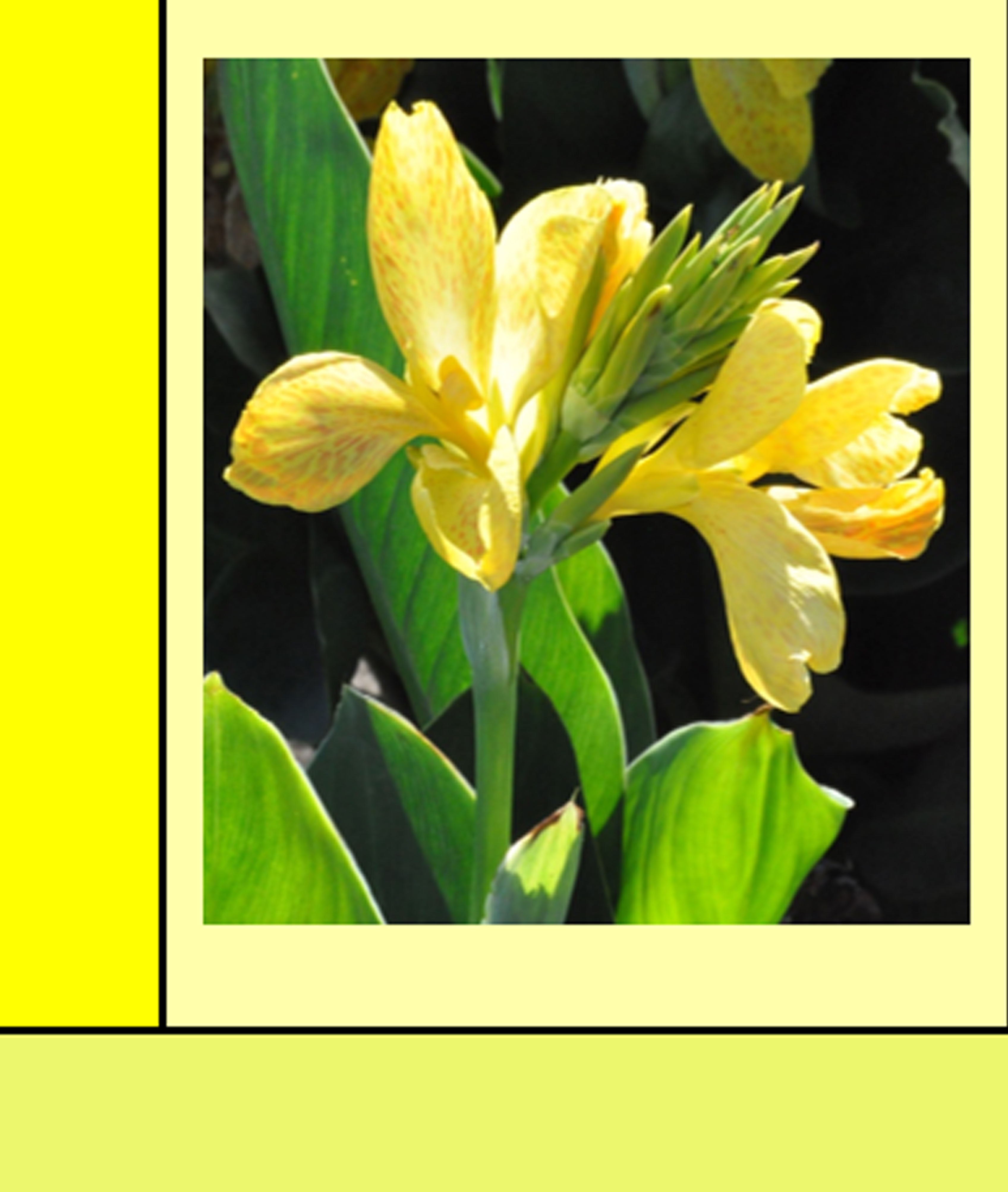
The color of sunlight and warmth, yellow is a cheerful color. It projects success and confidence and a youthful outlook on life. Since the eye sees yellow first, it draws attention quickly. Yellow is associated with clear thinking and happiness.

GREEN: Healthy, Abundant, Natural
Unsurprisingly, green is the color that communicates growth, renewal and life. It brings to mind a peaceful, serene environment and is considered refreshing. Green is nature’s neutral because it complements any color.

BLUE: Tranquil, Loyal, Responsible
Blue is another peaceful, soothing color. Soft shades of blue remind us of the calming effect of the sea and the sky. Darker hues inspires confidence and trust. Blue dulls the appetite, which makes sense, since there are not many naturally occurring blue foods.

PURPLE: Royal, Spiritual, Luxury
For centuries, purple has been the color of royalty and wealth stemming from the fact that purple dye was rare and expensive. Violet often evokes a spiritual feeling and a sensitive, compassionate nature. Purples are associated with self-awareness.

BROWN: Solid, Earthy, Reliable
Brown, on its own, can be perceived as dull and unsophisticated, but combining brown with other colors, it can be seen as confident and elegant. Brown is the color of stability, firmness and durability. It is also a color that is associated with a wholesome, organic life.

BLACK: Mysterious, Formal, Sophisticated
Powerful and controlling, black is a mysterious color. Actually a lack of color (when considered in terms of light, not pigment), black conveys a lack of hope; it portends evil, while still being elegant and dramatic. Black provides strong contrast so is often used to emphasize other colors.

WHITE: Pure, Innocent, Simple
If black is the lack of color and lack of hope, then white is the opposite. [ It is the combination of all colors when considered in terms of light, not pigment], White symbolizes innocence, purity and a completeness. It is the embodiment of hope. Like black, white offers contrast but in a warmer, soothing way.

GREY: Conservative, Detached, Dependable
A very practical color, grey serves as a neutral color in nature. It is not an attention- seeker, but does emanate reliability. Grey symbolizes unemotional compromise.
