By Sandra Nelson
For years, I thought that color was the most important element in garden design. I thought that if only I could learn to get the colors right, then I would finally have that show-stopping yard I had been dreaming about for years. It’s only been in the last few weeks that I have finally come to realize that line, form and texture are equally important elements in the overall success of a design and that neglecting to consider them leads to less than impressive gardens. This week, let’s take a look at these elements to see how they fit into the design process. Then, join us next week as we add a look at the impact color choices makes on your living work of art — your garden.
Line
For those of us who tend to think in very concrete terms, the word line often conjures up the mental picture of a straight, or perhaps curving, mark on paper. Moving into a more abstract mode however, the element of line constantly surrounds us in the composition of our lives. For example, as I sit here at my desk looking out the window into the yard, I can see the straight lines of the fence posts, the curving lines that form the arbor opening to the vegetable garden and the implied lines of the rows of lettuce. The lines are organizing the space and giving my eye a coherent path to move through the scene.
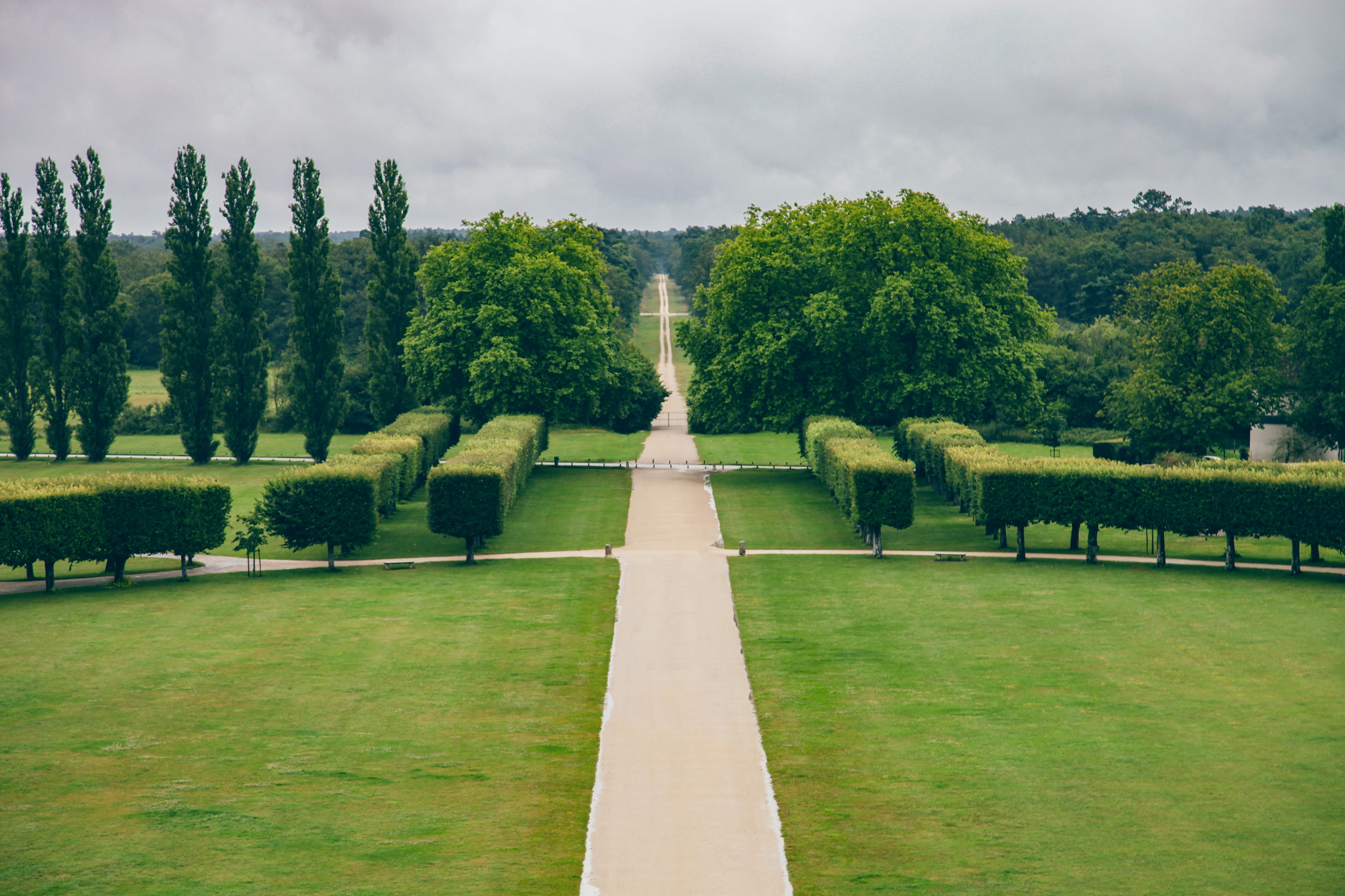
Lines have the ability to help determine how we respond, both physically and emotionally, to the landscape. Straight lines, especially when combined with a symmetrical composition, create a forceful attitude. They lead the viewer directly to the intended focal point with no meandering along the way. Formal designs often utilize straight lines.
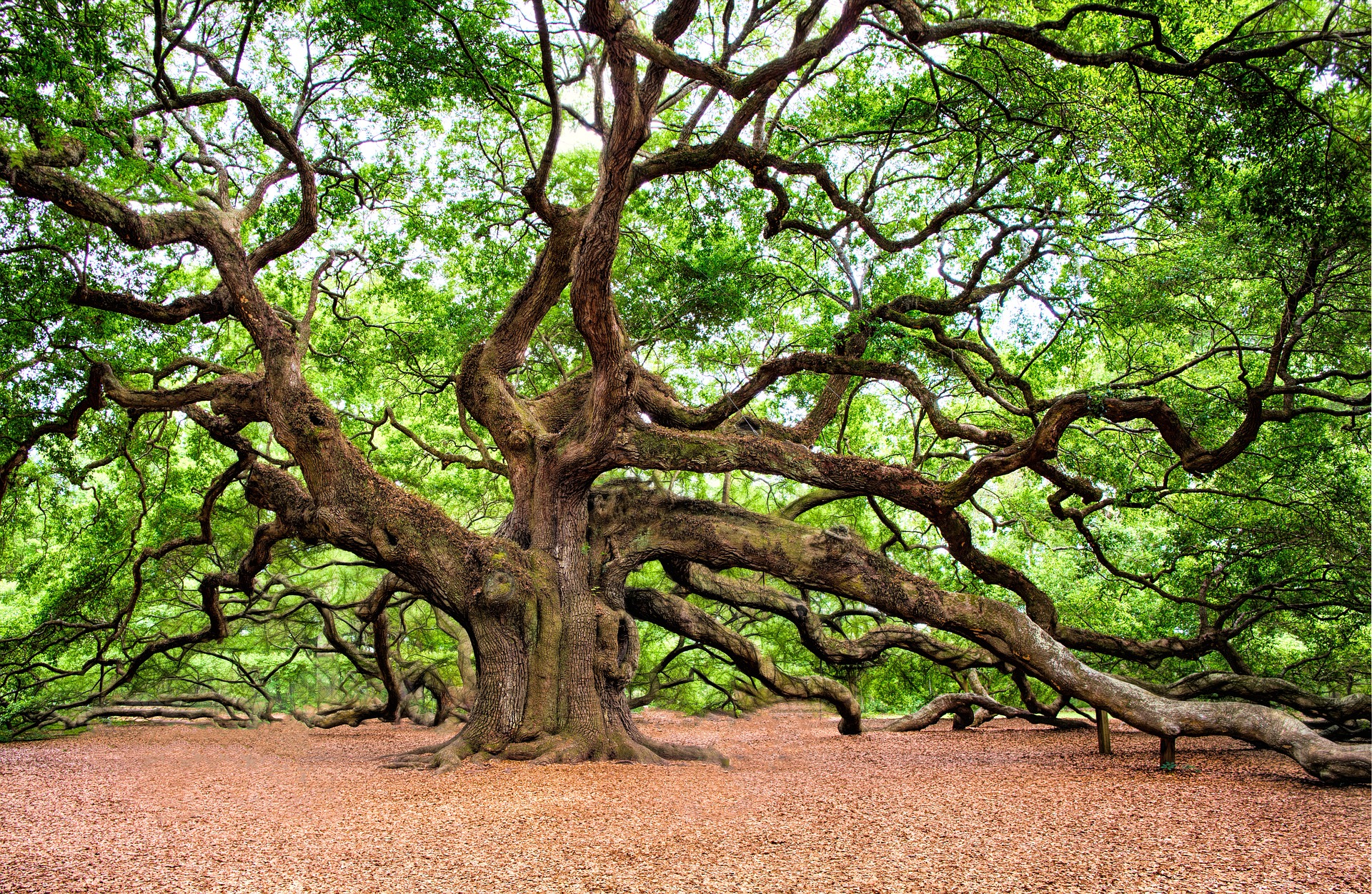
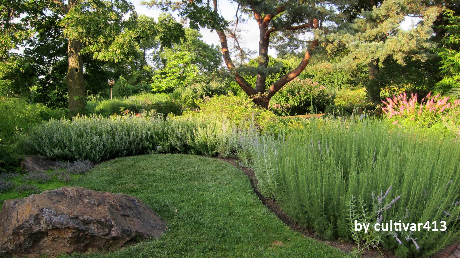
Curved lines mimic nature and communicate a more relaxed, informal atmosphere. Instead of expeditiously pulling the viewer along to a specific destination, curved lines move the eye at a slower, more relaxed rate. Using curved lines can add a sense of mystery since the eye cannot always see what is beyond the next bend.
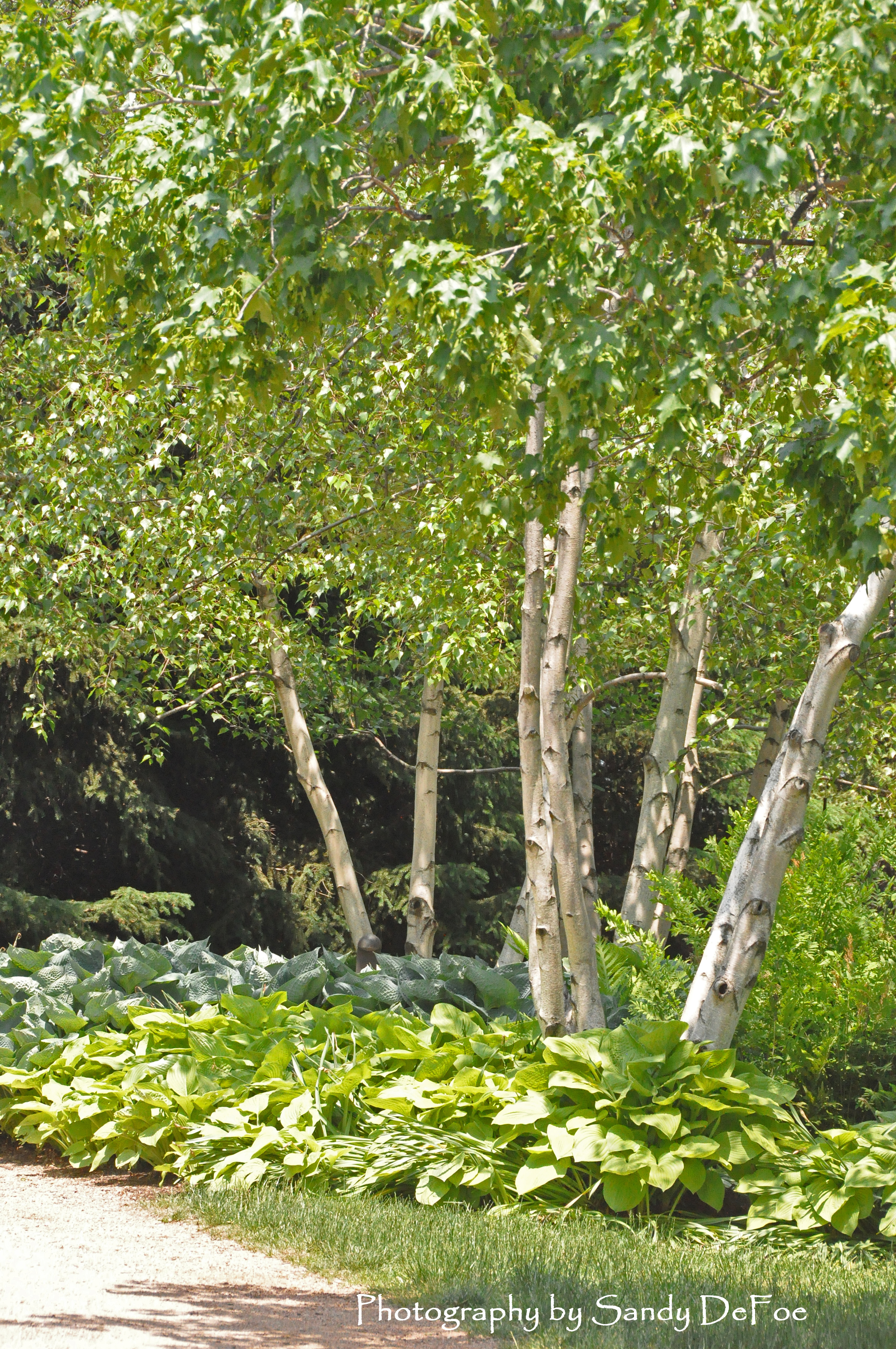
The deliberate use of line can also impact how we perceive the size of an area. Vertical lines move the eye upward to make a space feel larger and full of movement. They expand the view. Arbors, trees and upright plants can add vertical elements to the landscape.
Horizontal lines pull the eye along the ground plane and broaden the view. They can both tie spaces together and separate spaces. Low, horizontal lines can be calming and restful. Walkways, hedges and short garden walls can create strong horizontal lines.
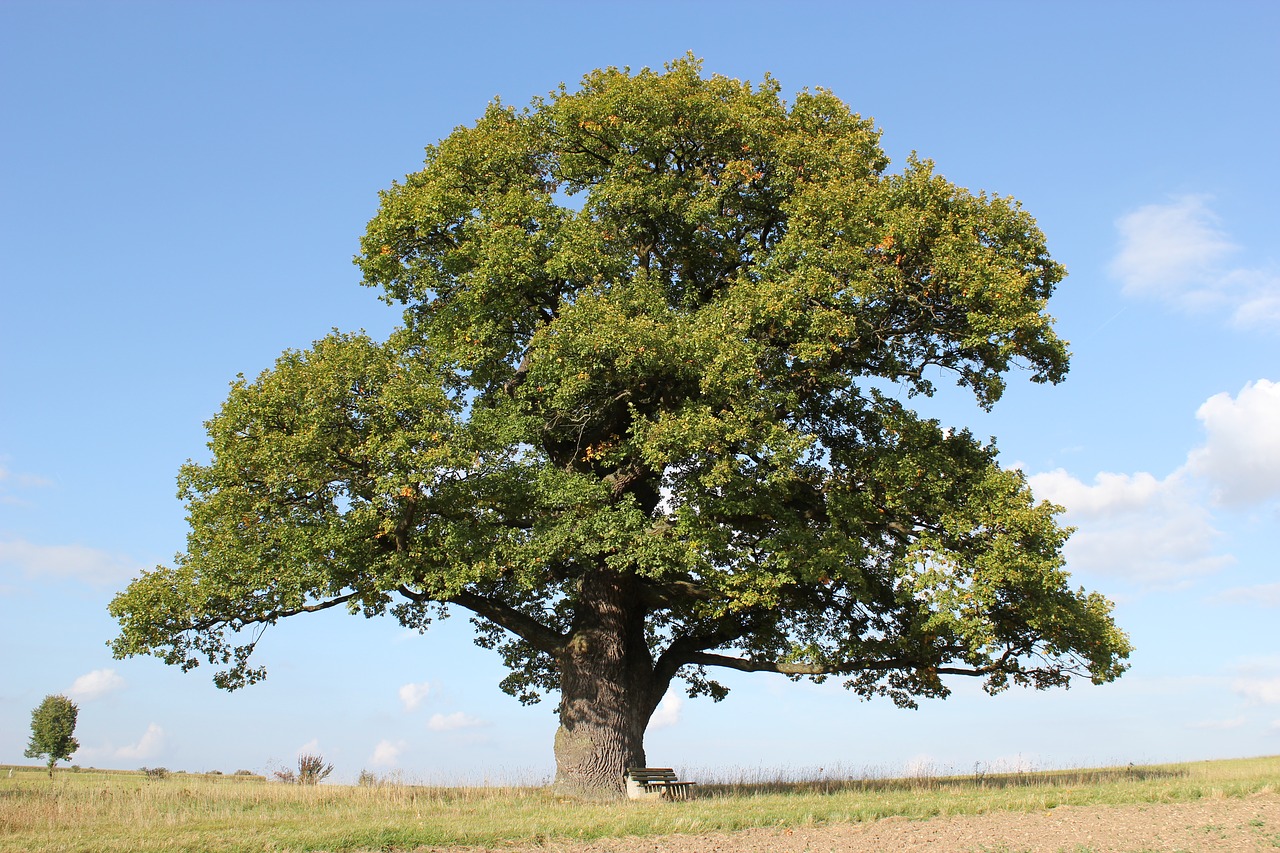
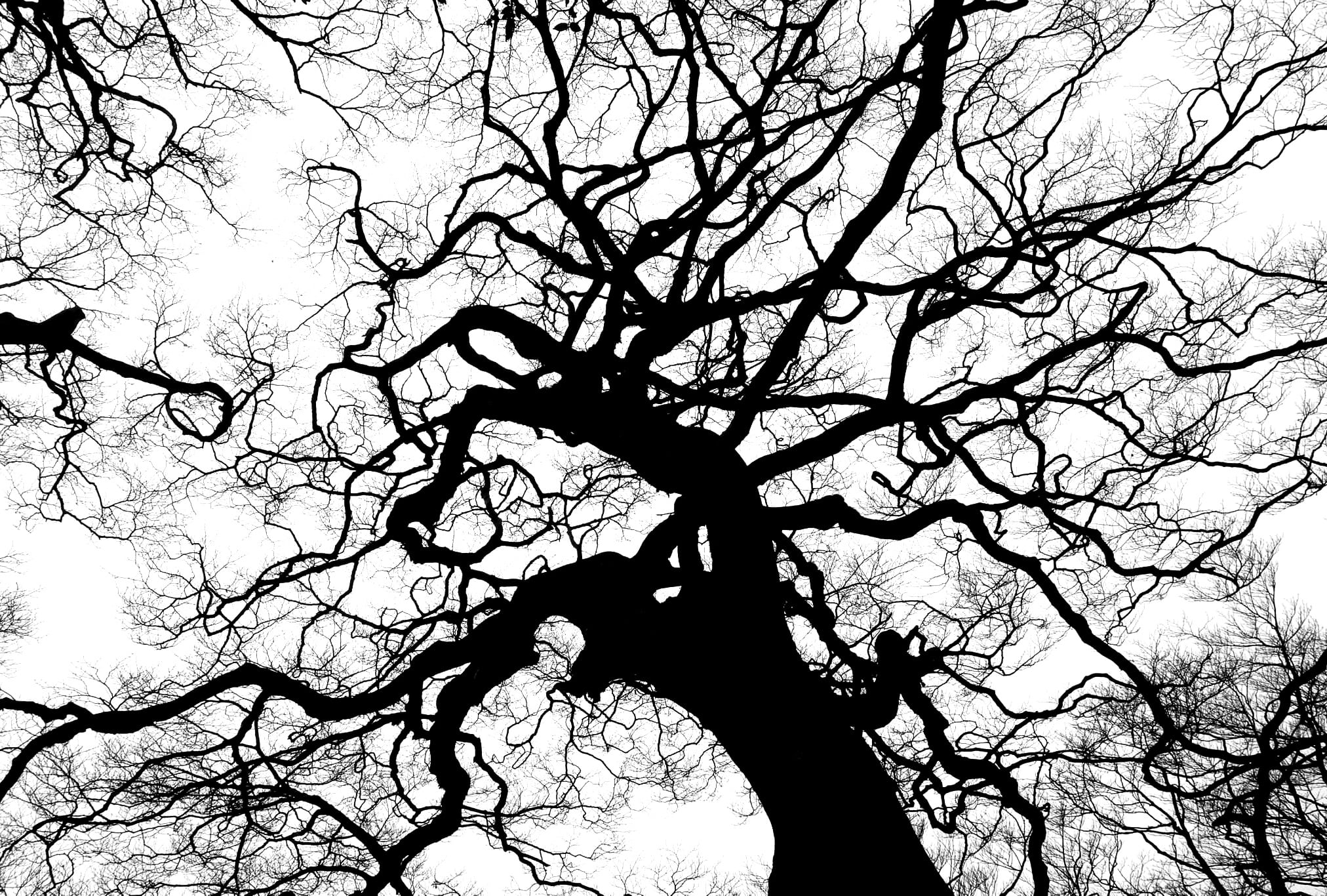
I’ve always thought that, in landscaping, shape and form were synonyms. Although some sources do use the terms interchangeably, most differentiate between the two. Shape describes the two-dimensional attributes of an object, while form refers to its three-dimensional qualities. The flat silhouette of a tree illustrates its shape, but its overall growth pattern — where it is narrow and where it is broad — shows its form. Both shape and form are important to the landscape since they are enduring characteristics, remaining beyond a single growing season. The shape and form of a garden are its backbone.
Shape and form, like line, help set the style, create the mood and carry the message of the garden. Using precisely trimmed, geometric shapes like circles, squares and polygons in both hardscape and plant materials define the space as formal, while irregular, flowing shapes and forms appear informal. A retaining wall constructed of jagged stacked stone defines a space much differently than a carved granite one. A series of hostas along a walkway welcomes you in much differently than a row of rounded boxwoods.
Repetition of shape and form helps create unity in a design, while contrast prevents monotony. A few well-selected, unique shapes can become striking focal points, drawing and holding the eye, but too many can make a garden chaotic and visually overwhelming.
Texture
Simply stated, texture is how hard or soft, coarse or fine, smooth or rough, light or heavy all of the elements of a landscape look and feel individually and as they work together. A space with lots of bold textures tends to be dramatic and often formal while a massing of fine textures can appear softer and more casual. Too much of any one type of texture is boring. For an engaging presentation, strive for a mixture of textures.
Coarse textured plants usually have large leaves, irregular edges and thick stems or trunks. They often have deep, rich colors and can have stiff leaves with thorns or spikes. Plants with bold, coarse textures range from hostas to yuccas.
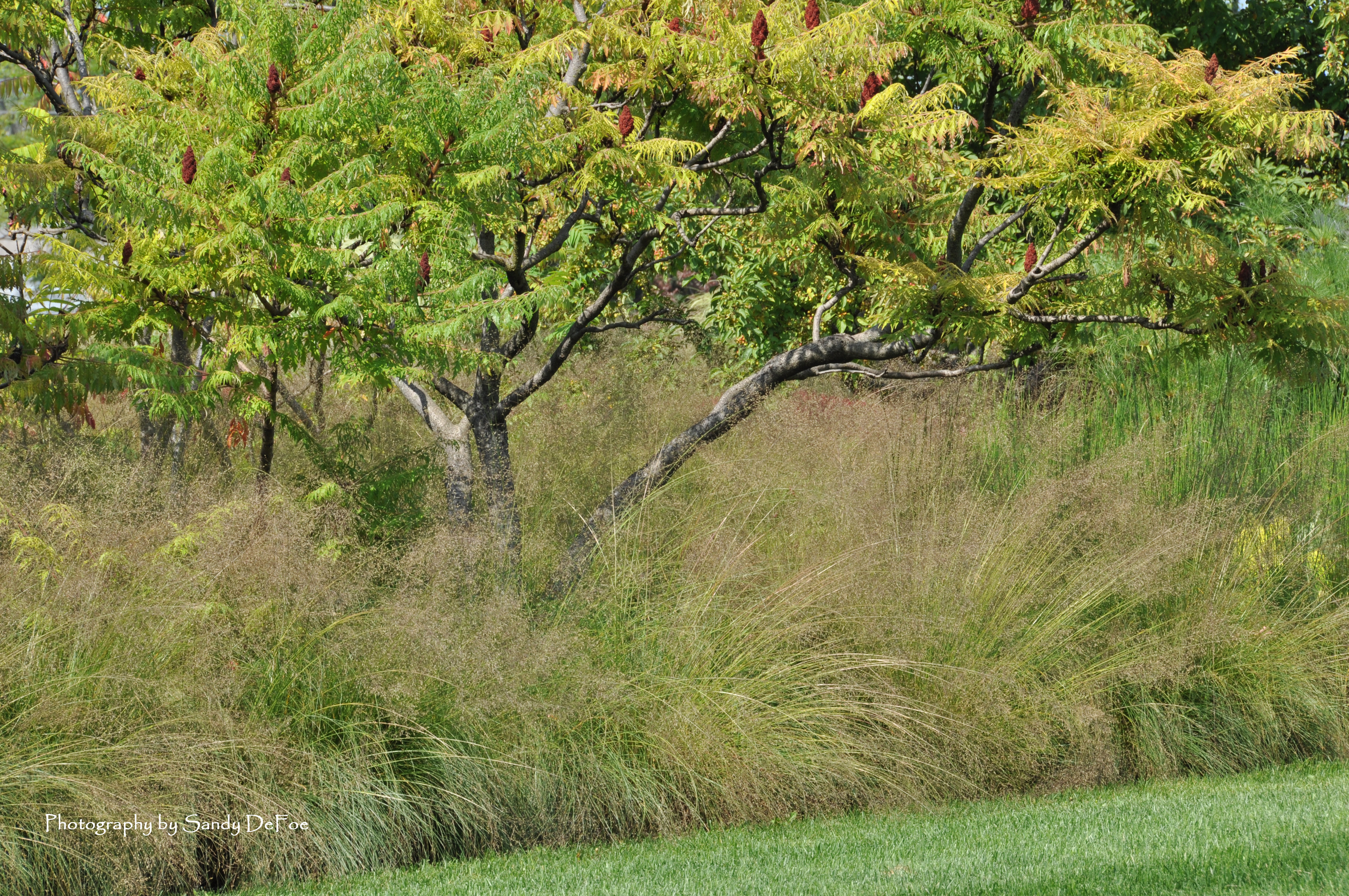
A fine textured plant has thin, almost papery leaves that add movement and even sound to the garden. They have tiny stems and can be described as wispy. Many have light-colored foliage and blooms of pastel colors. Coreopsis and many ornamental grasses are classified as having fine texture.
The vast majority of plants however, fall into a medium texture range with average size and shape of foliage, smooth edges and simple shapes. They are often rounded in shape. Forsythia is considered a medium textured plant.
Texture can be used to subtly manipulate the perception of a garden’s size. Placing plants with fine textures along the outer perimeter and the strong textures toward the front helps to add depth to the bed. The fine textures recede into the distance, while the bold ones draw and hold your attention. Conversely, to make a larger area seem more intimate, do the opposite. The eye will be drawn to the details in the coarse textures, visually pulling the space towards the viewer.


